

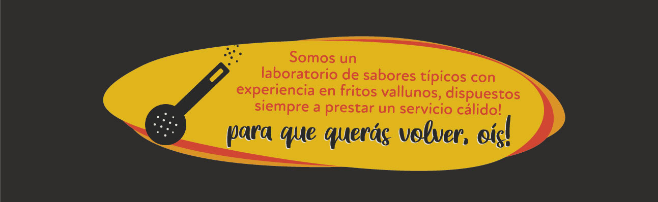
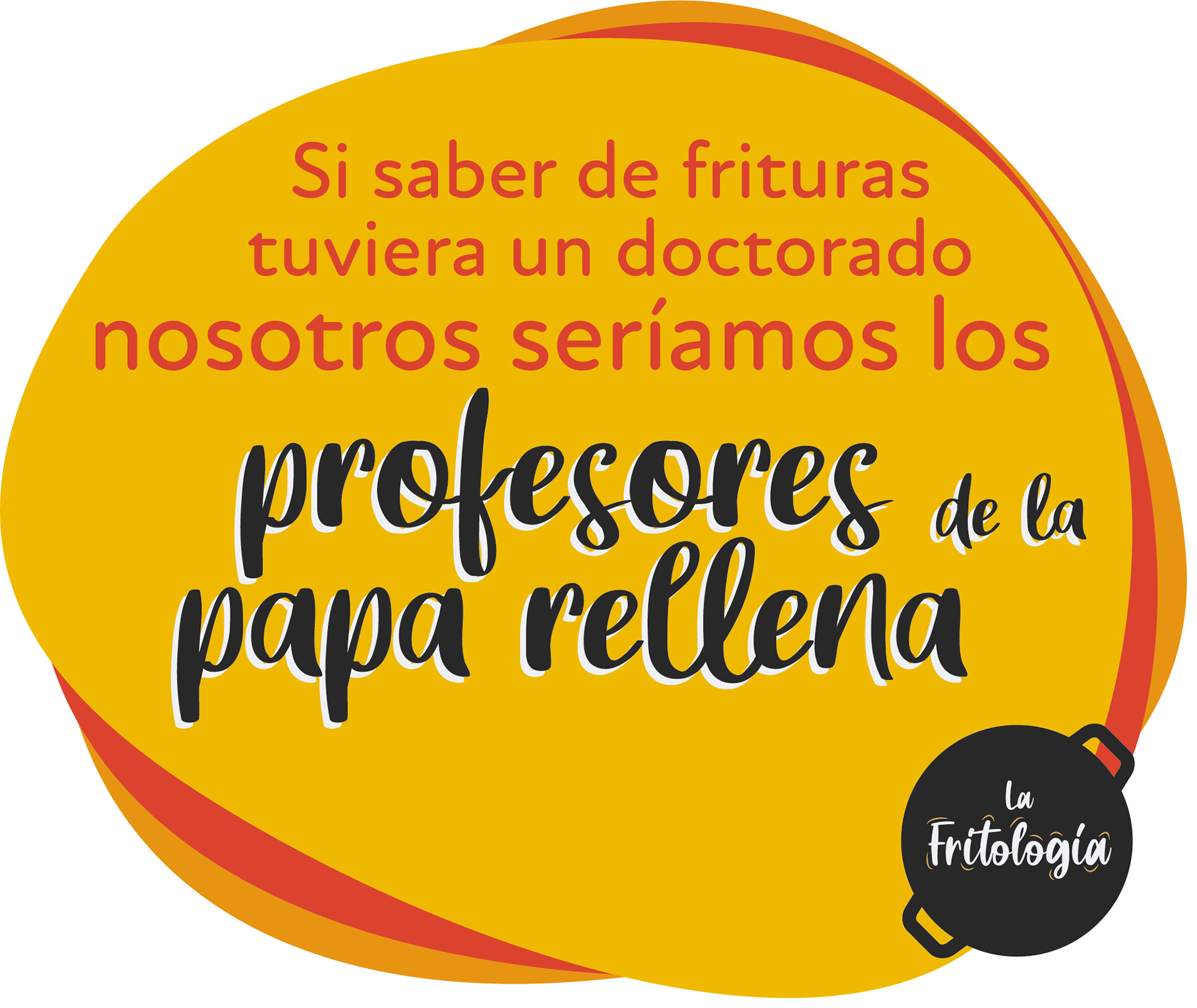
La Fritología was born in response to the growth of a small local business that, with careful recipes, has been successful in several points. The "fritos" are an important part of the Cali gastronomy, what is known as "mecato". The city is proud to have the most delicious fried foods in the country. And La Fritología are the experts in fried small foods.
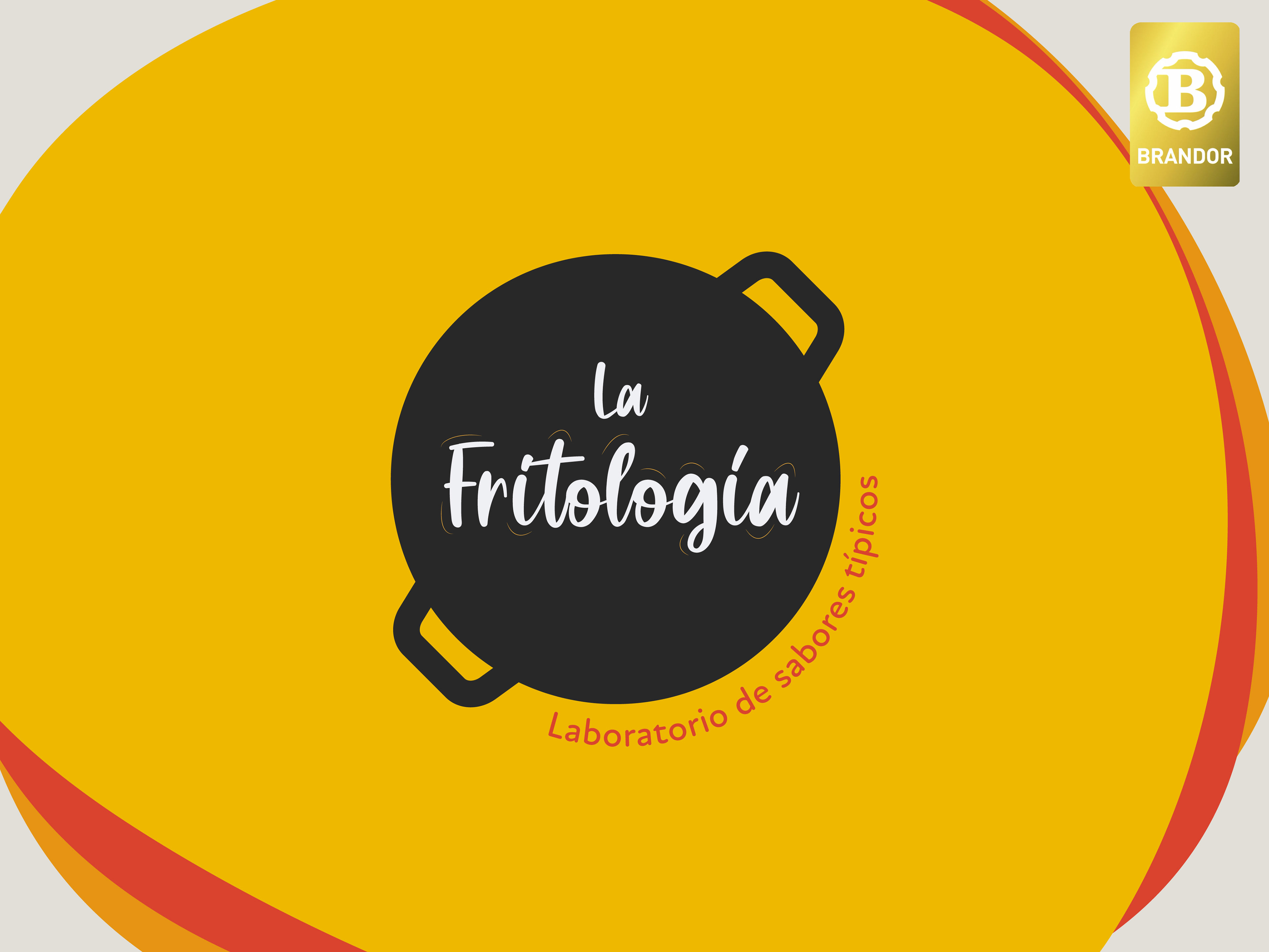
The name was born in response to the brand identity requirement of showing a brand that is an expert in fried foods. The name mentions fried foods as an entire branch of knowledge and gives it academic status. Adding the local lexicon spice, this is where the name and the new language of the brand were born.
Logo is inspired by typical tools and processes of fried food cooking through visual codes that are easy to recognize in the city's popular culture.
The visual identity system is organic in compositions and fonts, and "fried colored" according to the warmth of the people of Cali.


This project has been awarded for its name with the 2024 Brandor International Medal Selection.
Naming: Carlos Amézquita.
Design: Carlos Amézquita.